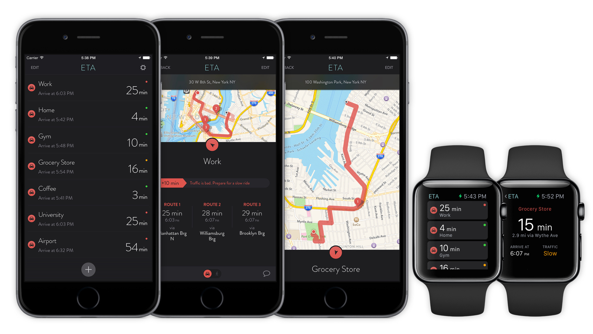
The idea behind ETA came to us late in 2013 with a simple need to go the shops. Conceived somewhat in frustration, on a 45 minute drive that normally takes 15. At the time, navigation and travel apps we're focused on directions but what we needed was a simple dashboard that focus on showing travel time. Our feeling was that you don't always need directions but being aware of traffic conditions is paramount to help with decision making on if or when to travel. Over the proceeding holiday period we got to work!
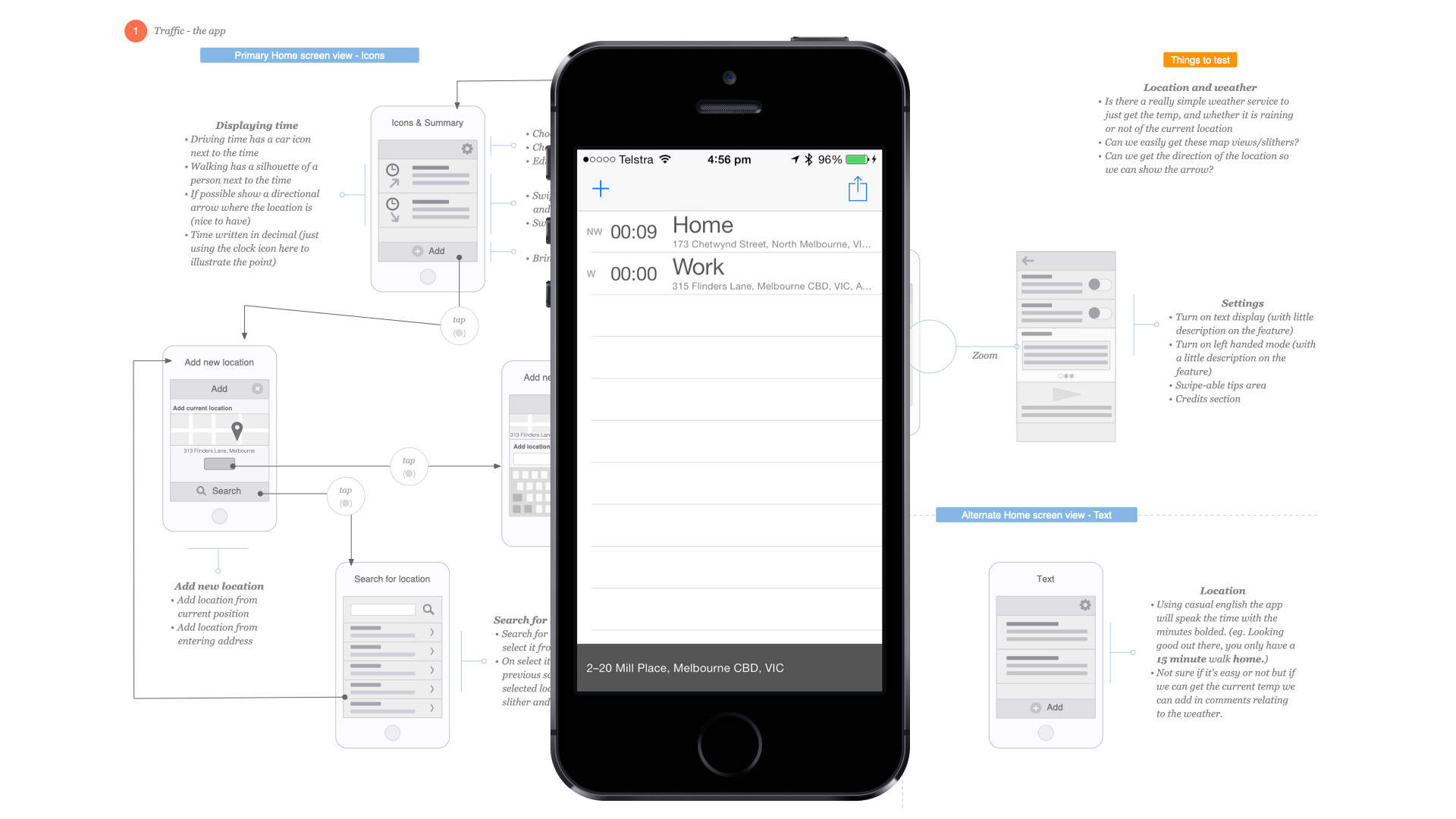
Our original flows and mini-wires and a screenshot of the first prototype
After some sketches and mini wires we embarked on the first prototype. It was pretty rough but demonstrated the idea of instantly showing travel time to a bunch of locations.

The inspiration behind ETA's colour palette
When it came time to design the UI we we're thick into the Australian Open played in Melbourne (our home city) at the time. Late nights watching Rafael Nadal compete gave us inspiration and his kit informed the app colour scheme ... the same palette you still in ETA today! Thanks Rafa! 🎾👍
It's live 🎉
ETA was welcomed to the App Store, February 2014. It was a unique app allowing users to save a dashboard of locations to quickly view travel time. It solved a simple problem, users that knew the route to the location but simply wanted travel time. Added to that it acted as a speed dial into turn by turn directions (initially supporting Apple and Google maps). Upon launch, ETA warmed the hearts of users and received glowing reviews from TechCrunch, LifeHacker, Business Insider and more.
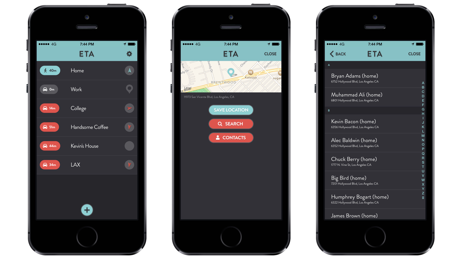
February 26, 2014: first available on the App Store 😀
Following initial launch a number of small releases followed that added integration with more navigation apps (Waze, TomTom, CityMapper) a URL scheme, support for over a dozen languages and more. The visuals received refinement along with a new app icon. It was less prescriptive and more abstract resembling headlights in a review mirror (as of course with ETA you'll always leave traffic in your wake 😀).
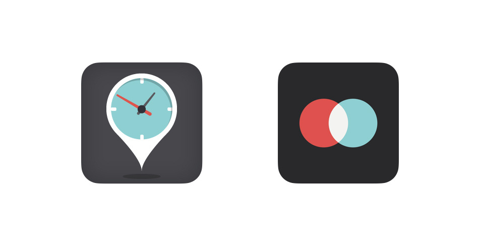
Old icon to the left, new to the right 🔴🔵
With iOS 8, Apple opened up the platform allowing more pervasive apps via Notification Centre widgets. ETA was one of the first to add support which delighted old and new users alike.
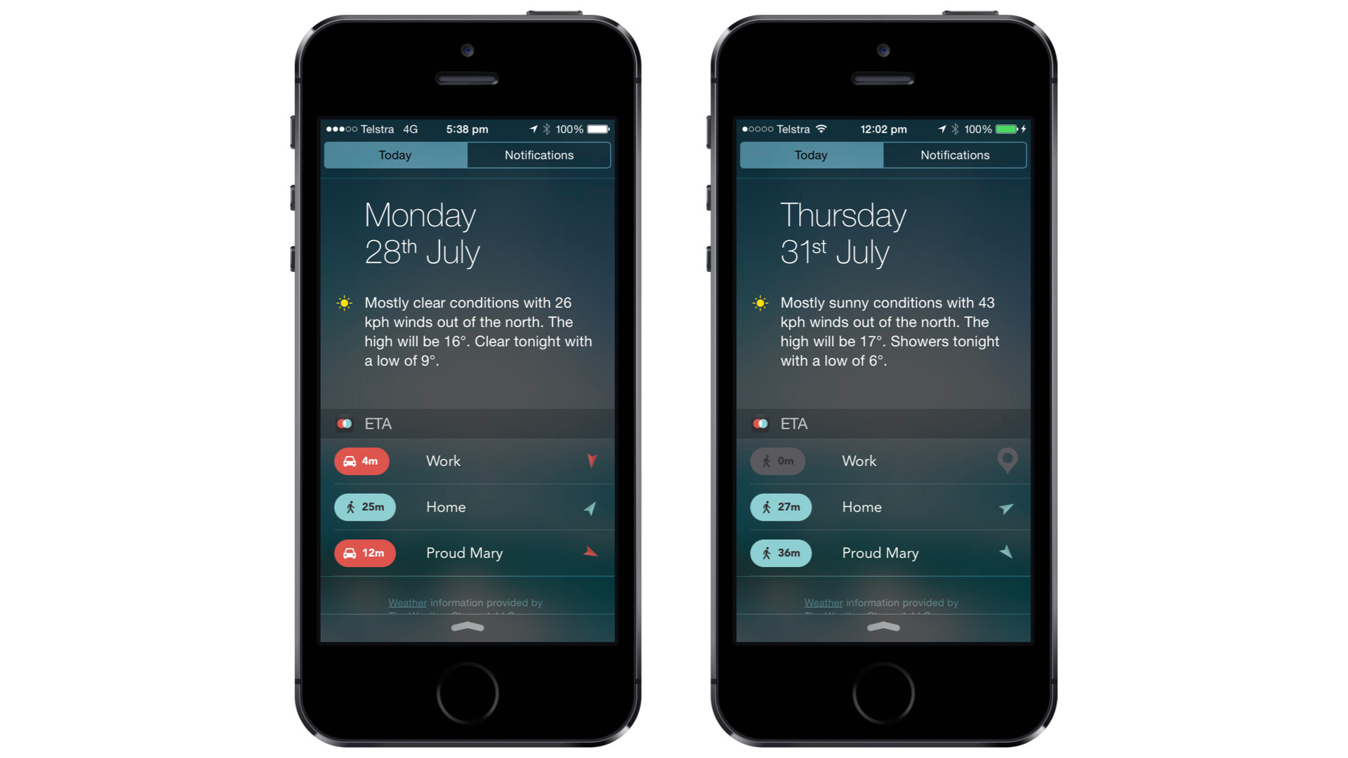
The ‘Today View’ widget presents travel time to your top three locations.
On your wrist
A bit over a year after its initial launch, we embarked on an entire redesign and rewrite of the codebase. Added to this, ETA was to spread its wings and move onto a new platform - the Apple Watch. The modern, fresh UI of ETA, coupled with being one of the first must have apps on Apple Watch proved very popular with customers.
Following features by the press and App Store it rocketed it up the charts! 🚀 Federico from MacStories commended its "look and how information is laid out on screen with a thoughtful use of icons and different colours" . Serenity from iMore awarded ETA an iMore Editors’ Choice award. Added to this Apple featured ETA as a ‘Best New App’ in a number of countries including the US, the UK and Australia. Finally, to cap things off ETA reached the top 10 on Product Hunt the day after launch.
Feel the power
In September of 2015, a few months after the Apple Watch released (and ETA's initial Apple Watch app went live), Apple introduced watchOS 2. This upgrade allowed native Apple Watch apps, unleashing immense potential and a raft of features that users were to love even to this day. One in particular feature was the introduction for app complications to display data on a user's watch face. ETA was one of the first apps to offer a complication and with it immediately became one of the devices must have apps. Supporting all forms of travel (including the newly announced public transit) as well as the Apple Watch's unique 'travel time' feature.
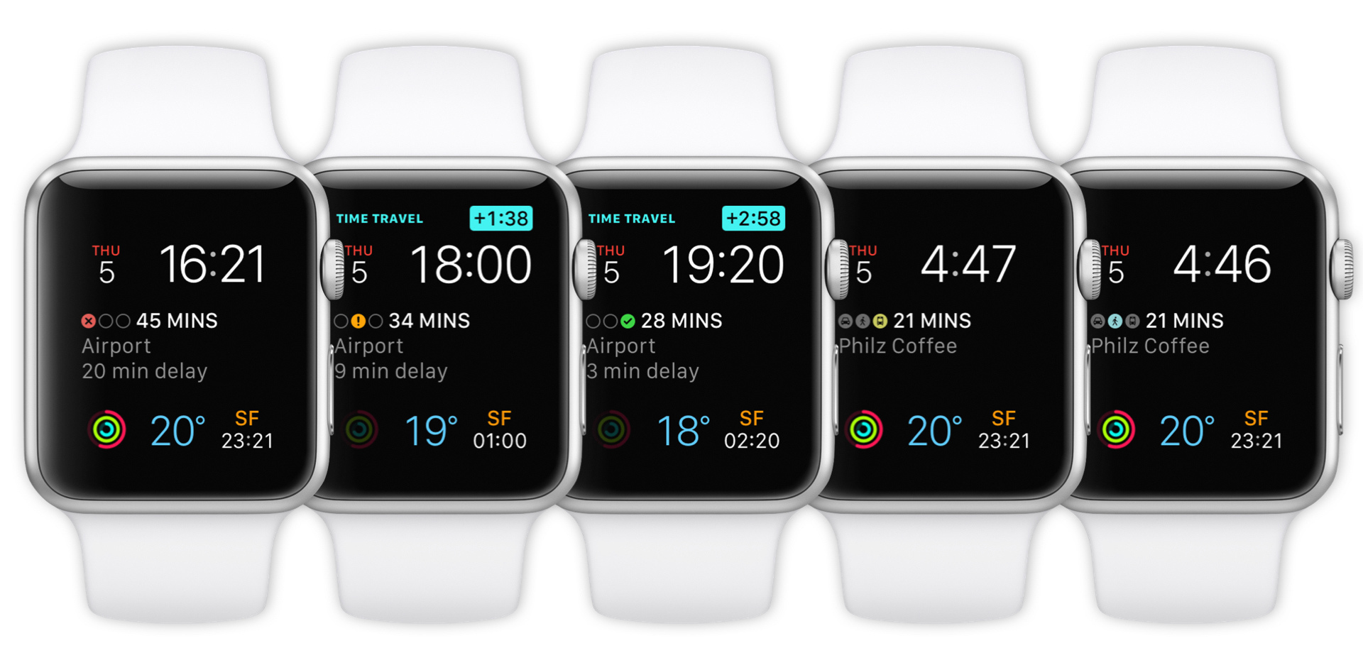
With watchOS 2 ETA introduced travel time on your watch face
Message your arrival
In September 2016 Apple continued its plan to open up core aspects of iOS with the launch of iMessage apps. Again, ETA was one of the first to offer a dedicated app and with it users were able to share their arrival times to friends and family without leaving Messages. At the time it was heralded ones of the best examples. Federico Viticci at MacStories said “ETA is one of the most useful, technically impressive iMessage apps I’ve tried.”
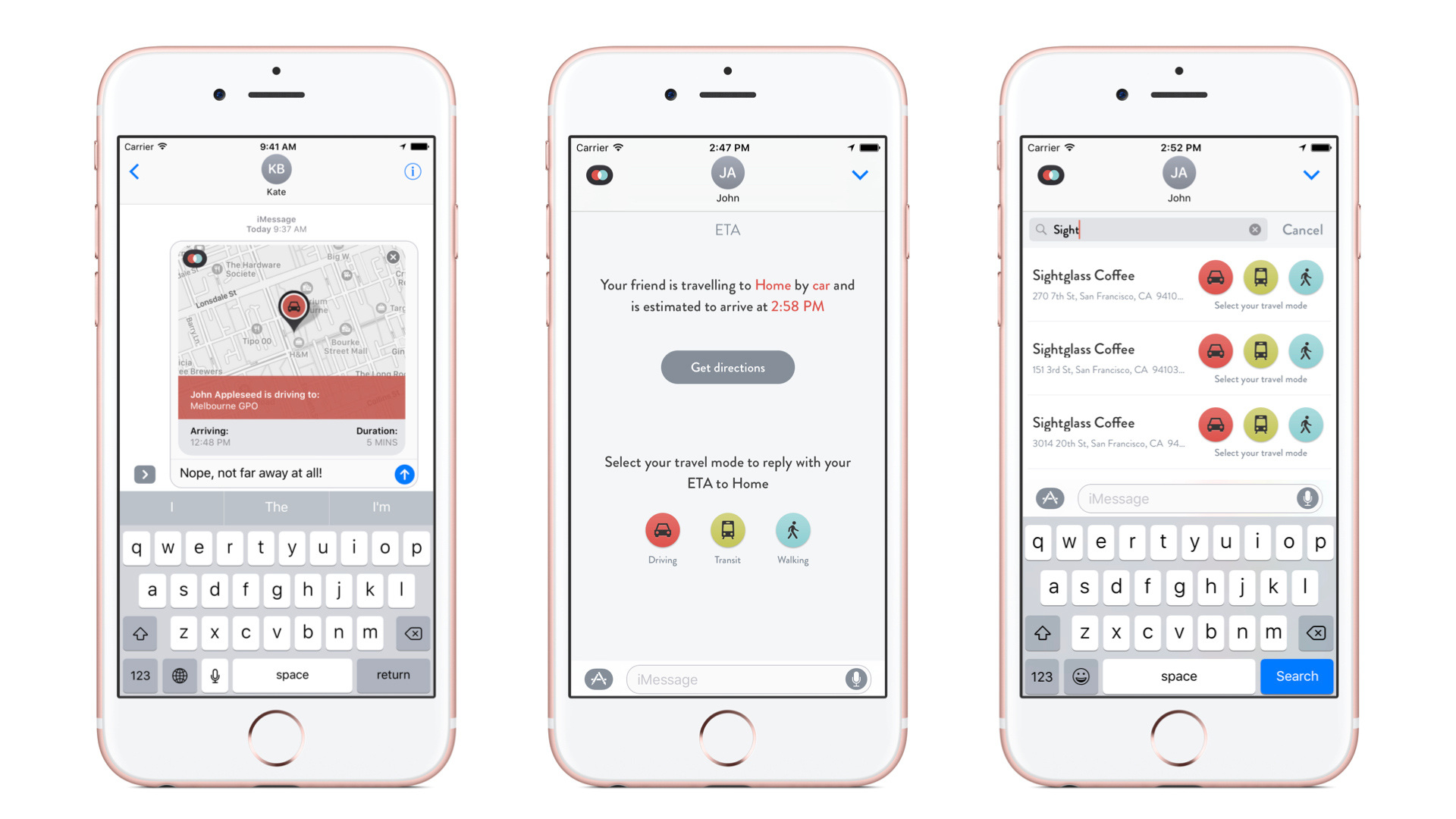
ETA's iMessage app
No intervention required
In August 2017 a big update to ETA ushered in our most requested feature, calendar sync. With calendar sync, travel time to appointments are automatically displayed. Intelligent location parsing (linking text in a calendar location field to a location in ETA) cemented ETA as a powerful address book for a user's important locations. Calendar sync was launched in unison across iOS, Apple Watch (including a complication) and in Today View in its own dedicated widget!
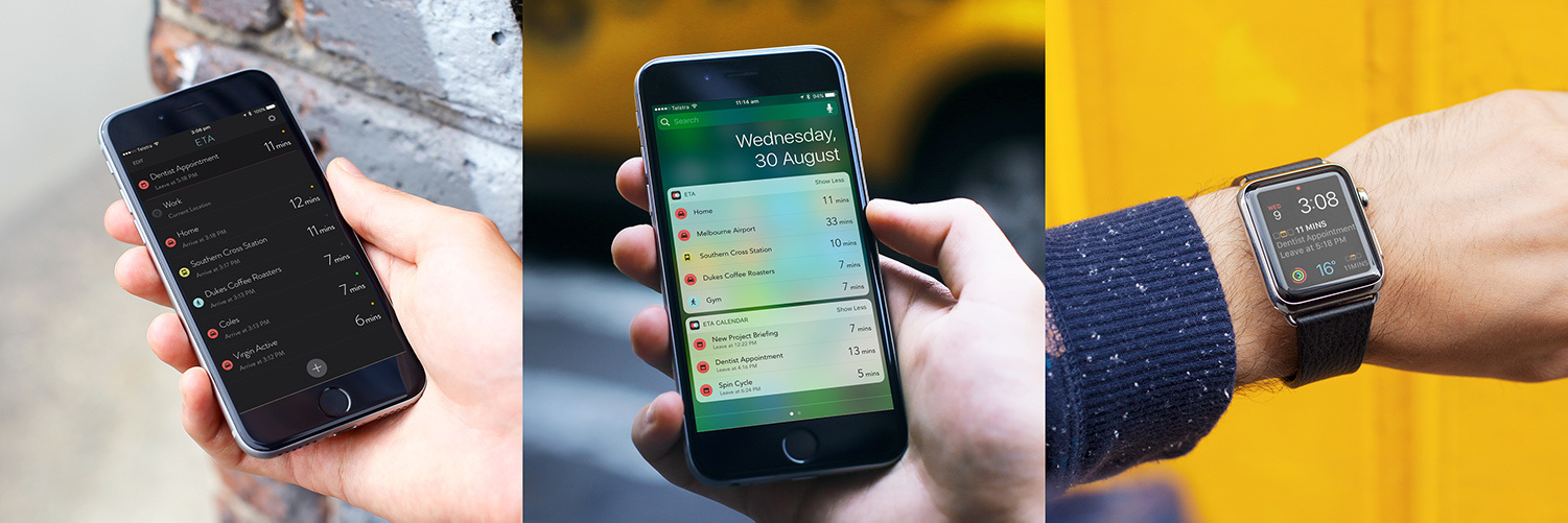
Calendar sync available across all devices
Siri knows best
Apple's focus with iOS 12 was to unlock the power of Siri allowing third party apps to fulfil user requests. With that users could create handy voice shortcuts to trigger functionality in their favourite apps. As always, ETA embraced this technology from day one and users loved being able to initiate directors or get a travel time estimate with a quick voice command!
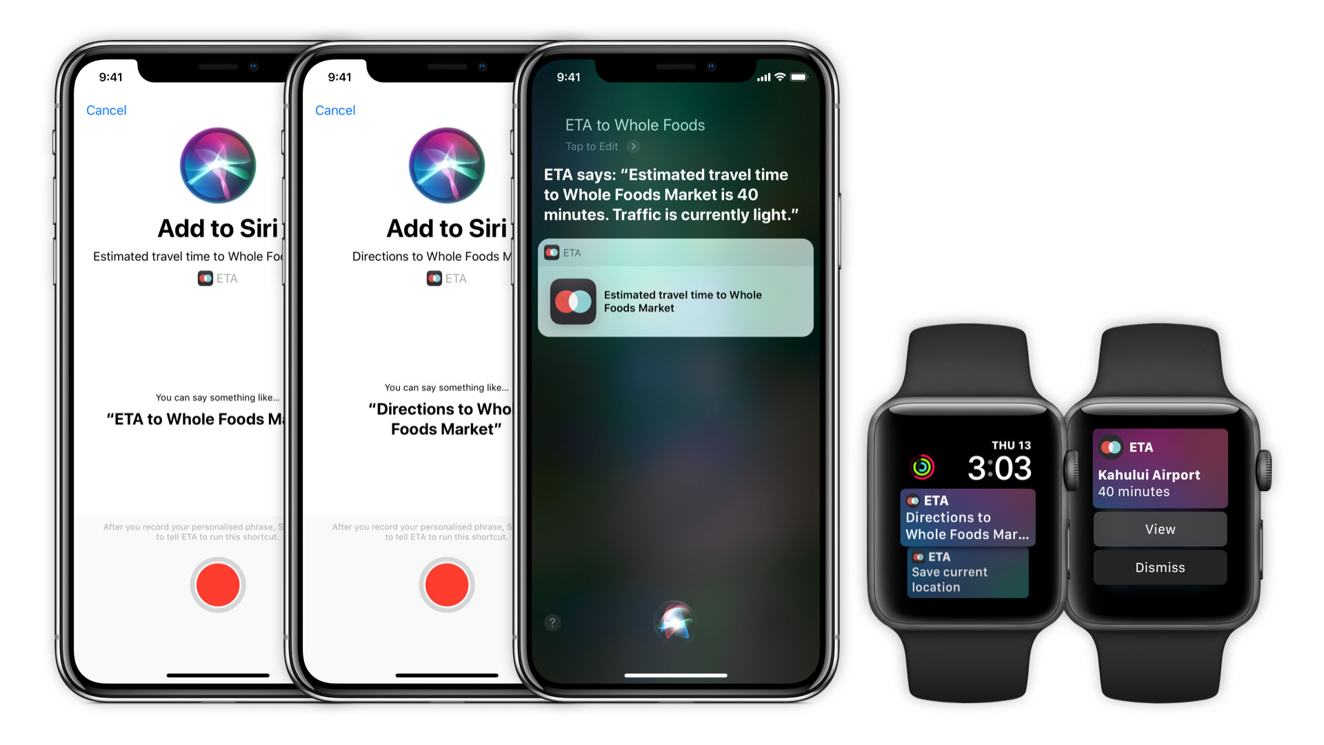
Create shortcuts on your phone and get intelligent prompts on your Apple Watch
Initiate dark mode🤘
With iOS 13 Apple turned out the lights bringing 'dark mode' to the masses. For ETA, with its predominately dark interface, the focus was on the widget to create a refined look for those using the new iOS feature.
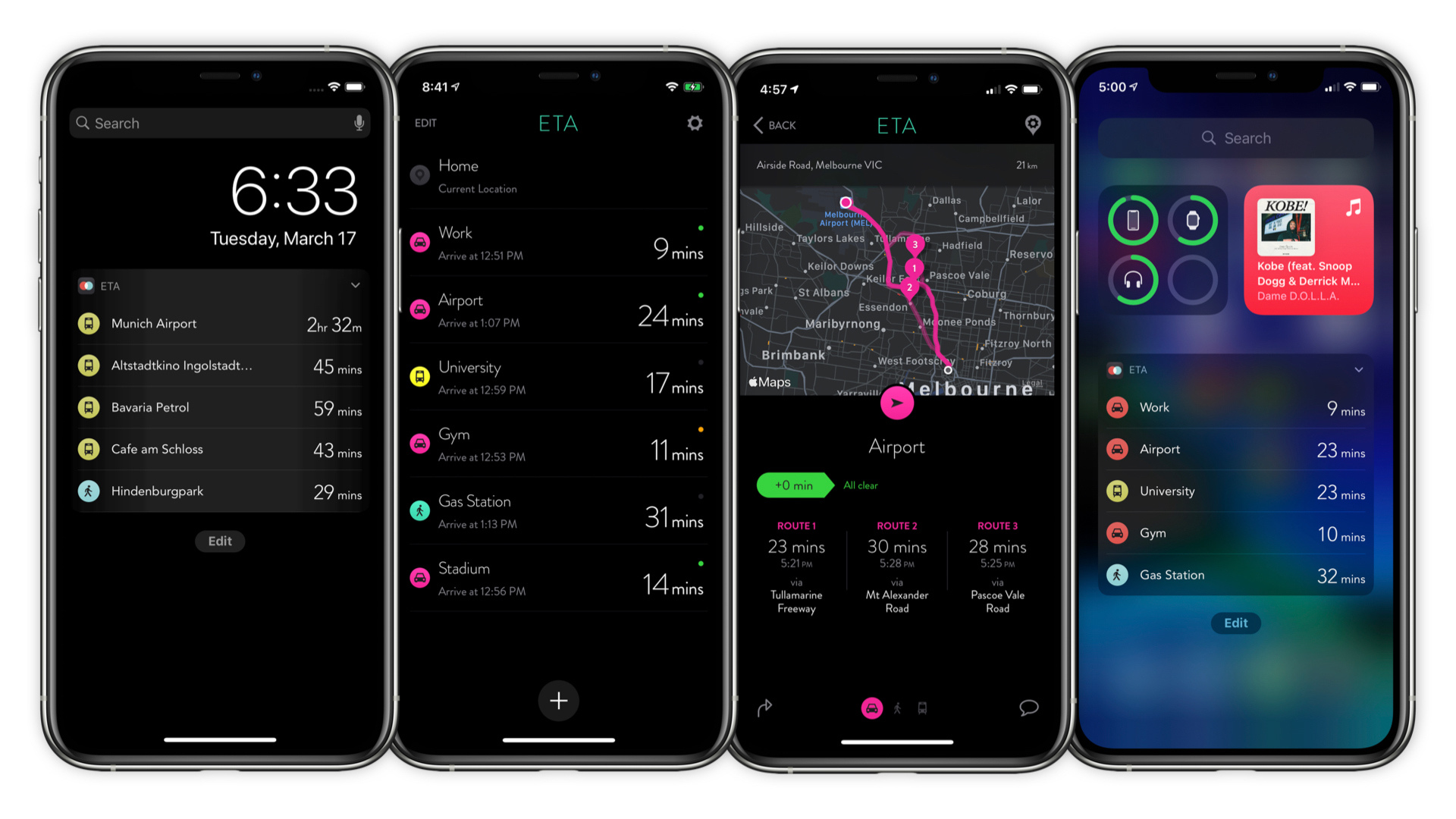
ETA in dark mode glory
Home Screen Widgets
No longer will your home screen just be for apps. With iOS 14 Apple unlocked all possibilities with the launch of Home Screen widgets. On day 1 ETA was there showcasing travel time and traffic to your favourite destinations!
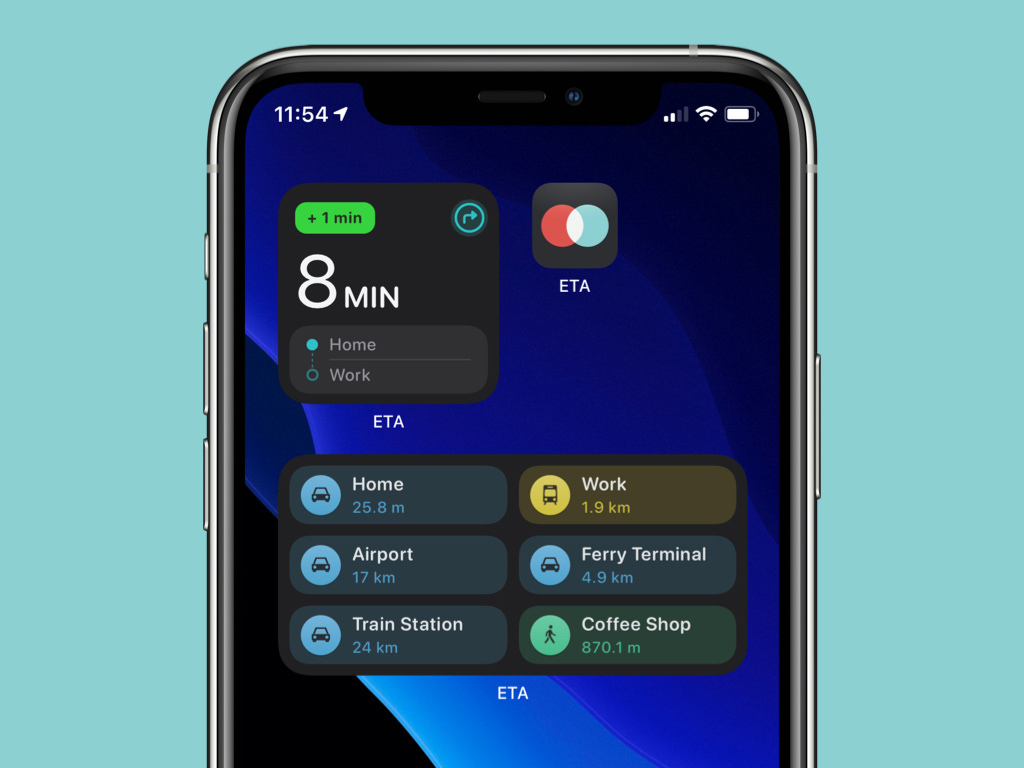
ETA's Homescreen
Thankful for the praise
Many nice things have been said about ETA in the press and by customer alike. The Apple too has featured ETA across both the iPhone and Apple Watch App Stores as well as on apple.com. We're humbled with the feedback and recognition and it continues to fuel our passion to bring more great features and improvements to ETA.
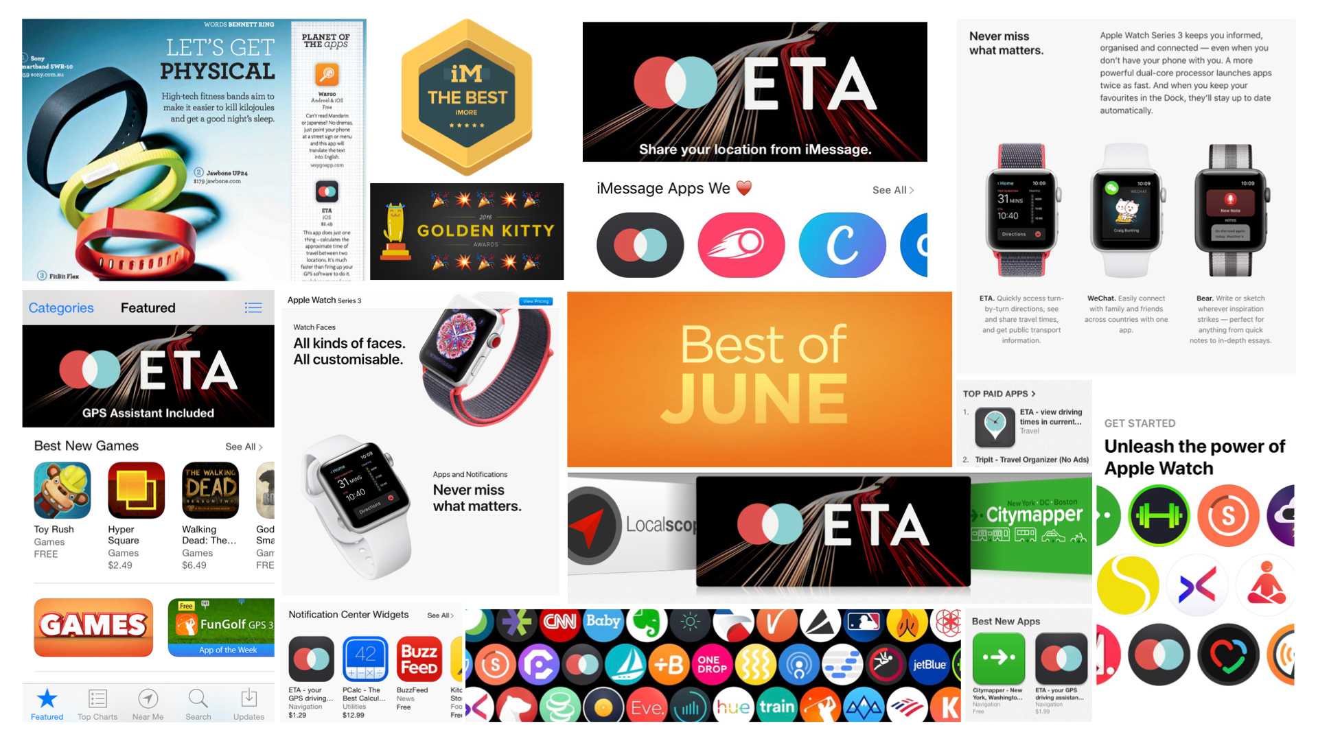
App Store features, awards, press write-ups
The best is yet to come
Over the 6+ years in the store ETA has grown alongside the evolution of the iPhone. It's adopted new platforms particularly the Apple Watch and regarded by many as one of the best apps on that device. From day one, ETA has remained 100% focused on its customers bringing features they love with security and privacy top of mind. For ETA, the future is bright with big updates planned and new platforms soon to be served.
Thanks to our loyal customers in supporting us over the journey. We can wait to share ETA's future with you! 😀
